Gold Master Final Version
HISTORY OF THE ROLEX SEA-DWELLER
Rolex's Conquest Of The Ocean
HISTORY OF THE ROLEX SEA-DWELLER
Rolex's Conquest Of The Ocean
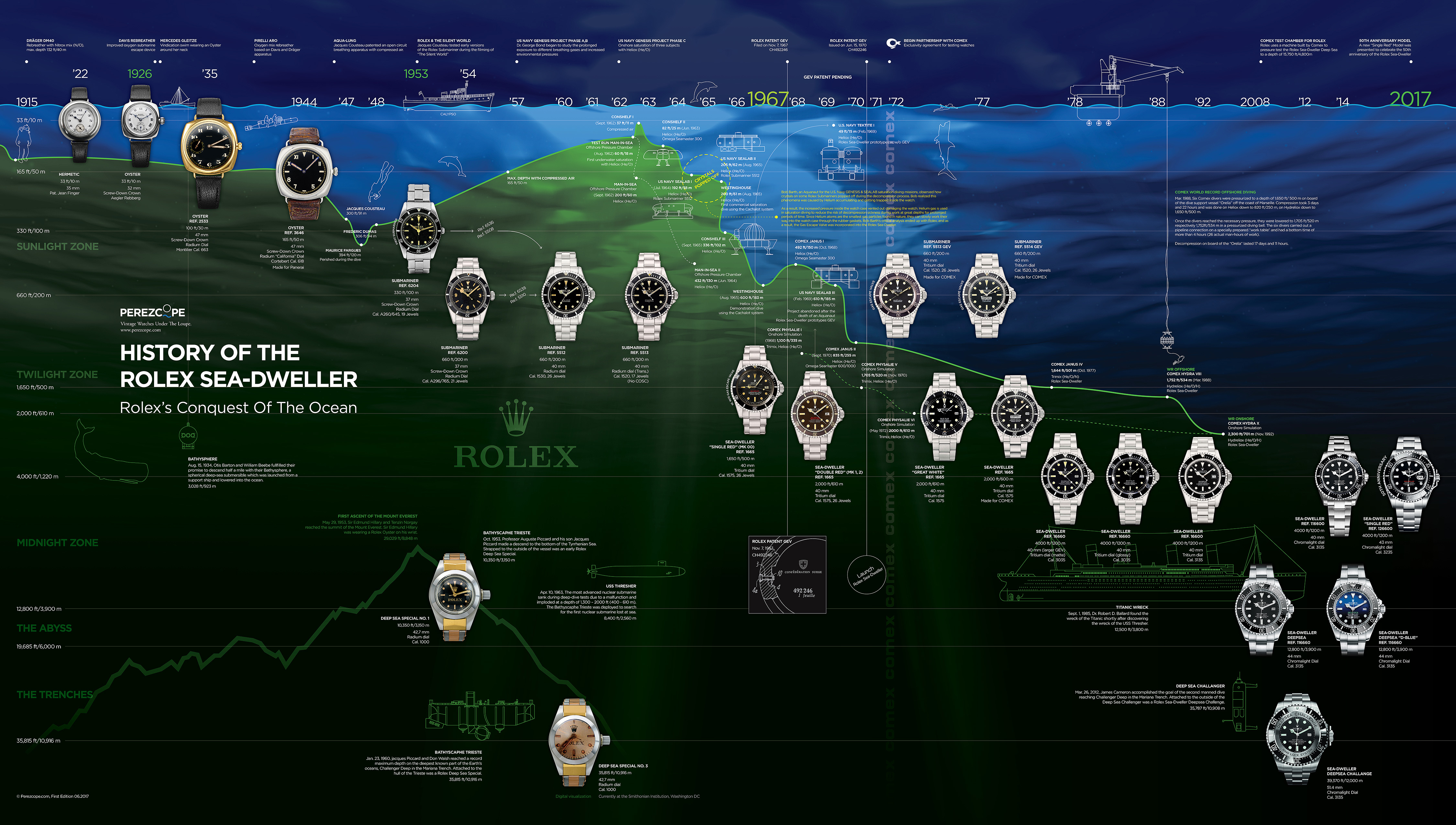
Jose from Perezcope.com just completed his last major update of his amazing HISTORY OF THE ROLEX SEA-DWELLER poster, and it is some kind of wonderful. The latest version of the poster ads much more fascinating detail as well a great deal of refinement. For instance, the Titanic ship grew tremendously to achieve a much better scale, and the USS Thresher Submariner was added to the timeline. Probably, the most outstanding new detail is the addition of the James Cameron DEEP-SEA is pictured on the far right. Since the gradient on the Cameron DEAP-SEA is very similar to the gradient on the poster, it really pops!!
I have worked with Jose on this poster for a long time now discussing historic, language and layout details. That being said, Jose deserves 100% of the credit for making this poster AMAZING!!!! I remember when Jose got started, and sent me the first draft, and I thought it was very cool, but I have to say the final version you are seeing above is an absolute work of high-art. On a side-note, Jose recently mentioned to me he is working on a Rolex Daytona Timeline Poster, which I am certain will be incredible!!!
TIP 1: THE HISTORY OF THE ROLEX SEA-DWELLER Poster has a 16x9 aspect ratio making it perfect to display on a computer monitor, or flat screen TV. In order to download the highest resolution version, right-mouse-click on the poster above, and select, "Open Image In New Window".
At first glance the most recent poster may not look that different, but it is almost night-and-day more detailed than the last version he published. I included one of the last versions of the poster (as seen below) that I published on May 4, 2017, for comparison sake.
TIP 2: To compare both posters, single-click on one in your browser window, which will take you into slide-show view. Then you can use the left and right arrows to instantly jump back and forth to compare both posters.
Update July 19, 2017: Jose had one last minor update to the poster, thus the version seen above now is the most recent, and I believe, final-final...


0 Yorumlar