 |
| Copyright MARVEL COMICS |
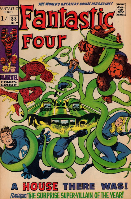
Okay, having taken a short detour to cop a gander at some Big John Buscema FF covers, it's now time to return to some more by Jack 'King' Kirby. Is it my imagination, or does the colouring on the accompanying covers look a little 'dull' and sombre in comparison to Big John's in the previous post, which seemed a tad brighter and more vibrant to my eyes. Maybe it was a change in colourists, or just a change in direction, but I have the distinct impression that Marvel comic covers in the '70s seemed more 'colourful' (you know what I mean) than in the preceding decade. Or could it simply be that my '60s FFs have lost their lustre due to the effects of age and that the '70s mags will eventually follow suit? Anyway, should you wish to contribute your views on the matter (or anything resembling it), your participation will be very welcome.


0 Yorumlar